
此模块定义了一组分层的 ftxui::Element。元素管理布局并可以响应终端尺寸变化。请注意以下示例,其中此模块用于创建包含许多操作符的简单布局:
Example 部分提供了一系列示例。
示例:
...
gauge(0.5)
text("The footer")
});
document = border(document);
document = document | border.
document |= border
...
}
The FTXUI ftxui:: namespace.
元素列表
所有元素都已包含在内,可以通过包含相应的头文件来访问:
#ifndef FTXUI_DOM_ELEMENTS_HPP
#define FTXUI_DOM_ELEMENTS_HPP
#include <functional>
#include <memory>
class Node;
using Element = std::shared_ptr<Node>;
};
Element separatorCharacter(std::string);
Color unselected_color,
Color selected_color);
Element separatorVSelector(
float up,
Color unselected_color,
Color selected_color);
Element gaugeRight(
float progress);
Element spinner(
int charset_index,
size_t image_index);
Element paragraph(
const std::string& text);
Element paragraphAlignLeft(
const std::string& text);
Element paragraphAlignRight(
const std::string& text);
Element paragraphAlignCenter(
const std::string& text);
Element paragraphAlignJustify(
const std::string& text);
Element canvas(
int width,
int height, std::function<
void(Canvas&)>);
Element canvas(std::function<
void(Canvas&)>);
Decorator focusPositionRelative(
float x,
float y);
Decorator selectionBackgroundColor(Color foreground);
Decorator selectionForegroundColor(Color foreground);
Decorator selectionStyle(std::function<
void(Pixel&)> style);
Element gridbox(std::vector<Elements> lines);
namespace Dimension {
Dimensions
Fit(
Element&,
bool extend_beyond_screen =
false);
}
}
#include "ftxui/dom/take_any_args.hpp"
#endif
Element focusCursorBarBlinking(Element)
Same as focus, but set the cursor shape to be a blinking bar.
Element clear_under(Element element)
Before drawing |child|, clear the pixels below. This is useful in combination with dbox.
Element vscroll_indicator(Element)
Display a vertical scrollbar on the right. Colors follow the content.
Element nothing(Element element)
A decoration doing absolutely nothing.
Decorator size(WidthOrHeight, Constraint, int value)
Apply a constraint on the size of an element.
Direction
Direction is an enumeration that represents the four cardinal directions.
Element focusCursorUnderlineBlinking(Element)
Same as focus, but set the cursor shape to be a blinking underline.
Element focusCursorBar(Element)
Same as focus, but set the cursor shape to be a still block.
Element focusCursorBlock(Element)
Same as focus, but set the cursor shape to be a still block.
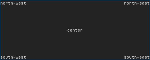
Element center(Element)
Center an element horizontally and vertically.
Element focusCursorUnderline(Element)
Same as focus, but set the cursor shape to be a still underline.
Element align_right(Element)
Align an element on the right side.
Element hscroll_indicator(Element)
Display a horizontal scrollbar at the bottom. Colors follow the content.
Element focus(Element)
Set the child to be the one focused among its siblings.
Element vcenter(Element)
Center an element vertically.
Element focusCursorBlockBlinking(Element)
Same as focus, but set the cursor shape to be a blinking block.
Element hcenter(Element)
Center an element horizontally.
BorderStyle
BorderStyle is an enumeration that represents the different styles of borders that can be applied to ...
Dimensions Fit(Element &, bool extend_beyond_screen=false)
std::function< Element(Element)> Decorator
std::shared_ptr< Node > Element
Element xframe(Element)
Same as frame, but only on the x-axis.
std::vector< Element > Elements
Element yframe(Element)
Same as frame, but only on the y-axis.
Element select(Element e)
Set the child to be the one focused among its siblings.
Decorator reflect(Box &box)
std::function< std::vector< int >(int, int)> GraphFunction
Element frame(Element)
Allow an element to be displayed inside a 'virtual' area. It size can be larger than its container....
text
最简单的控件。它显示文本。
text("I am a piece of text");
vtext
与 ftxui::text 相同,但垂直显示。
代码:
终端输出:
paragraph
类似于 ftxui::text,但单个单词会根据其容器的宽度换行到多行。
示例代码:
paragraph("A very long text")
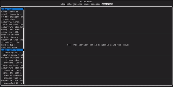
有关更详细的示例,请参阅 详细示例。Paragraph 还包括许多其他变体,如下所示:
Element paragraph(std::string text);
Element paragraphAlignLeft(std::string text);
Element paragraphAlignRight(std::string text);
Element paragraphAlignCenter(std::string text);
Element paragraphAlignJustify(std::string text);
}
border
在元素周围添加边框。
代码:
border(text("The element"))
终端输出:
┌───────────┐
│The element│
└───────────┘
[!note] 您可以使用管道操作符实现相同的行为。
代码:
text("The element") | border
Border 也有多种样式,如下所示:
window
ftxui::window 是一个 ftxui::border,但带有一个额外的标题。要在元素周围添加窗口,请将其包装并指定一个字符串作为标题。 代码:
window("The window", text("The element"))
终端输出:
┌The window─┐
│The element│
└───────────┘
separator
显示垂直/水平线,以视觉上将容器内容一分为二。
代码:
border(
hbox({
text("Left"),
separator(),
text("Right")
})
)
终端输出:
┌────┬─────┐
│left│right│
└────┴─────┘
Separators 有多种类型,如下所示:
Element separatorCharacter(std::string);
Color background,
Color foreground);
Element separatorVSelector(
float up,
Color background,
Color foreground);
}
gauge
这是一个表示进度比率的视觉元素。
代码:
终端输出:
┌────────────────────────────────────────────────────────────────────────────┐
│██████████████████████████████████████ │
└────────────────────────────────────────────────────────────────────────────┘
Gauges 可以以多种方向显示,如下所示:
namespace {
Element gauge(float ratio);
Element gaugeLeft(float ratio);
Element gaugeRight(float ratio);
Element gaugeUp(float ratio);
Element gaugeDown(float ratio);
Element gaugeDirection(float ratio, GaugeDirection);
}
graph
参见:
Element graph(GraphFunction);
Colors
大多数终端控制台可以显示彩色文本和彩色背景。FTXUI 支持所有调色板:
Decorator color(Color);
Decorator bgcolor(Color);
颜色 画廊: 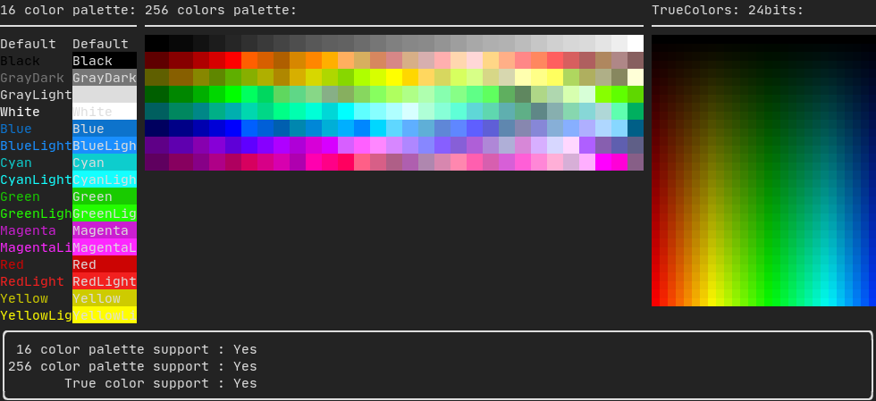
Palette16
在大多数终端上支持以下颜色:
- Default (默认)
- Black (黑色)
- GrayDark (深灰色)
- GrayLight (浅灰色)
- White (白色)
- Blue (蓝色)
- BlueLight (浅蓝色)
- Cyan (青色)
- CyanLight (浅青色)
- Green (绿色)
- GreenLight (浅绿色)
- Magenta (洋红色)
- MagentaLight (浅洋红色)
- Red (红色)
- RedLight (浅红色)
- Yellow (黄色)
- YellowLight (浅黄色)
使用管道操作符使用上述颜色的示例:
text("Blue foreground") | color(Color::Blue);
text("Blue background") | bgcolor(Color::Blue);
text("Black on white") | color(Color::Black) | bgcolor(Color::White);
Palette256
在支持 256 色的终端上。
text("HotPink") | color(Color::HotPink);
TrueColor
在支持 TrueColor 的终端上,您可以直接使用 24 位 RGB 颜色空间:
使用以下构造函数指定颜色的 RGB 或 HSV 值:
有两个构造函数:
static Color HSV(uint8_t hue, uint8_t saturation, uint8_t value)
Build a Color from its HSV representation. https://en.wikipedia.org/wiki/HSL_and_HSV.
static Color RGB(uint8_t red, uint8_t green, uint8_t blue)
Build a Color from its RGB representation. https://en.wikipedia.org/wiki/RGB_color_model.
LinearGradient
FTXUI 支持线性渐变。可以在前景色或背景色上使用。
Decorator color(const LinearGradient&);
Decorator bgcolor(const LinearGradient&);
ftxui::LinearGradient 由一个角度(度)和颜色停止点列表定义。
auto gradient = LinearGradient()
.Angle(45)
.AddStop(0.0, Color::Red)
.AddStop(0.5, Color::Green)
.AddStop(1.0, Color::Blue);
您也可以使用简化的构造函数:
LinearGradient(Color::Red, Color::Blue);
LinearGradient(45, Color::Red, Color::Blue);
参见 演示。
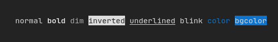
Style
除了彩色文本和彩色背景。许多终端支持文本效果,例如:bold(粗体)、italic(斜体)、dim(暗淡)、underlined(下划线)、inverted(反转)、blink(闪烁)。
Element bold(Element);
Element italic(Element);
Element dim(Element);
Element inverted(Element);
Element underlined(Element);
Element underlinedDouble(Element);
Element strikethrough(Element);
Element blink(Element);
Decorator color(Color);
Decorator bgcolor(Color);
Decorator colorgrad(LinearGradient);
Decorator bgcolorgrad(LinearGradient);
示例
要使用这些效果,只需用您想要的效果包装您的元素:
underlined(bold(text("This text is bold and underlined")))
或者,使用管道操作符将其链接到您的元素上:
text("This text is bold") | bold | underlined
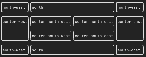
Layout
使元素能够以以下方式排列:
- 水平 使用
ftxui::hbox
- 垂直 使用
ftxui::vbox
- 在网格内 使用
ftxui::gridbox
- 沿一个方向换行 使用
ftxui::flexbox。
使用 ftxui::hbox、ftxui::vbox 和 ftxui::filler 的 示例:
使用 ftxui::gridbox 的 示例:
使用 flexbox 的 示例:
查看此 示例 和相关的 演示。
元素也可以使用 ftxui::flex 装饰器变得灵活。
代码:
hbox({
text("left") | border ,
text("middle") | border | flex,
text("right") | border,
});
终端输出:
┌────┐┌─────────────────────────────────────────────────────┐┌─────┐
│left││middle ││right│
└────┘└─────────────────────────────────────────────────────┘└─────┘
代码:
hbox({
text("left") | border ,
text("middle") | border | flex,
text("right") | border | flex,
});
终端输出:
┌────┐┌───────────────────────────────┐┌───────────────────────────────┐
│left││middle ││right │
└────┘└───────────────────────────────┘└───────────────────────────────┘
Table
能够轻松地将数据格式化为整洁的表格形式。
代码示例:
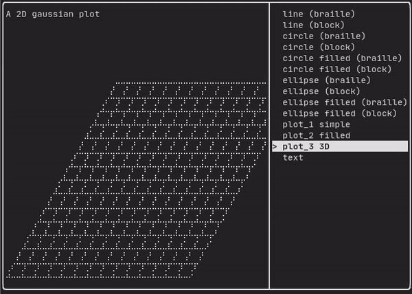
Canvas
参见 API <ftxui/dom/canvas.hpp>
auto c = Canvas(100, 100);
c.DrawPointLine(10, 10, 80, 10, Color::Red);
auto element = canvas(c);
可以在 ftxui::Canvas 上进行绘图,使用盲文、块或简单字符:
简单 示例:
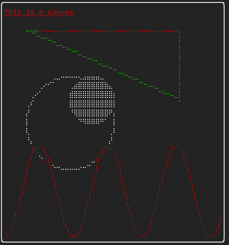
复杂 示例: